Add SightMap® Embedded in-line
Overview
You can add SightMap directly on the page by embedding it in-line via an iframe.

Need some practice?If you don't have your SightMap embed link yet, you can use this one for testing purposes: https://sightmap.com/embed/e8ywkqrqwlx.
Process
- The SightMap application is designed to be responsive. Create a container within the page and insert the HTML embed code (see below).
- Ensure the container is be large enough to show the entire embed plus about 2.5%+ margins, ensuring mobile users can scroll past the iframe.
<iframe title="SightMap interactive property map showing unit availability for [PUT YOUR PROPERTY NAME HERE]" width="100%" height="100%" src="https://sightmap.com/embed/e8ywkqrqwlx" frameborder="0" allow="geolocation; web-share; clipboard-write"></iframe>
Container OptimizationThe entire embed should fit within the viewport, while maximizing the available space. This way, the map is large and easy to use without any portion of the application being off-screen. View width (vw) and view height (vh) values on the container tend to work well.
Setting a max-width is helpful for ultrawide or high resolution screens, where the user may not want the SightMap to be as large.
Embedded Maps on Mobile
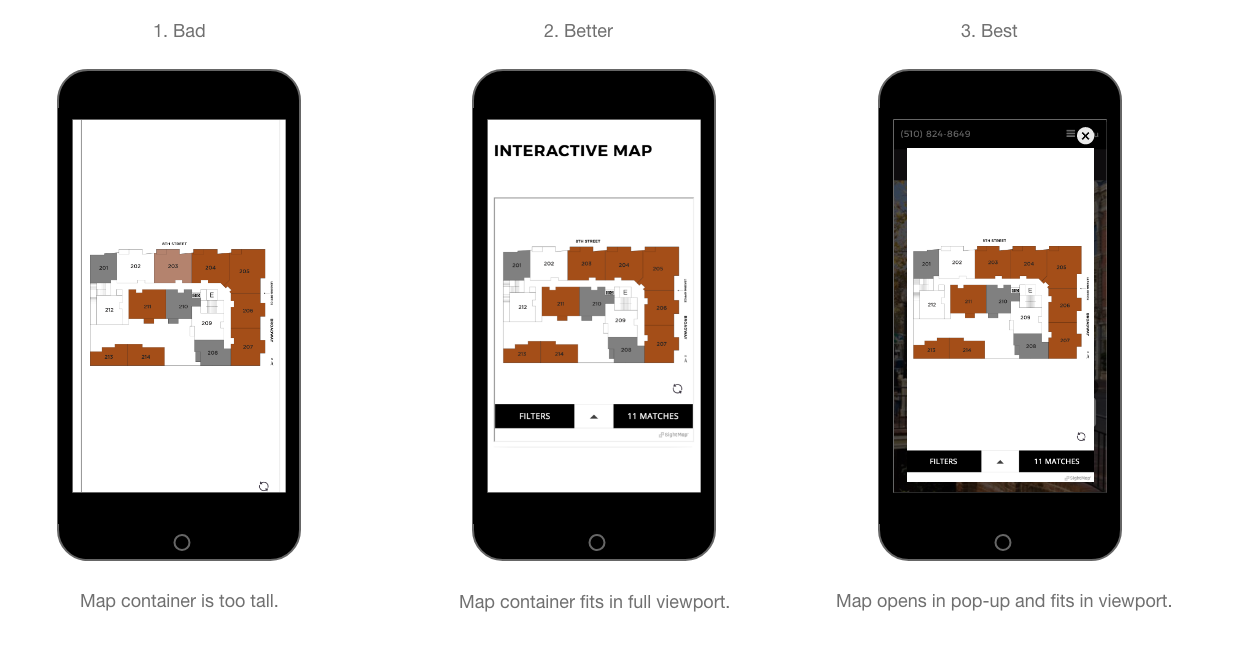
Maps embedded-in line can be too tall on mobile. The user may not see the filters and the user can get stuck scrolling in the white space surrounding the map. (See image #1 below.)
There are two ways to optimize the SightMap mobile experience:
A. You can keep the map embedded in-line and adjust the height of the container on mobile only. Ideally, the height of the container should adapt to the device's viewport. (See image #2 below.)
B. You can have the map open in a pop-up/modal on mobile only. (See image #3 below.)

Code Samples
SightMap embedded in-line
A simple use case, where the software is embedded in the web page.
Heads up: Maps in the mirror will be larger than they appear.The size of the map in these JSFiddles is scaled to the size of the example window. As such, the size of the map will be much larger on an actual website.
Updated about 1 month ago
